Responsive Design Website: Build for Every Device
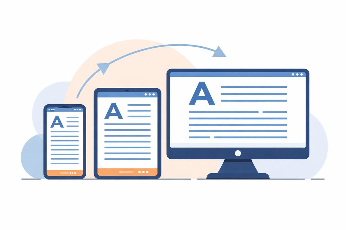
Modern web users expect seamless experiences regardless of whether they're browsing on a desktop monitor, tablet, or smartphone. A responsive design website automatically adjusts its layout, images, and functionality to deliver optimal viewing across every screen size and device type. This approach has evolved from a nice-to-have feature to an absolute necessity for businesses that want to rank well on search engines, convert visitors into customers, and maintain competitiveness in 2026. The stakes are higher than ever, with Google's mobile-first indexing and AI-powered search engines prioritizing sites that deliver excellent user experiences across all platforms.
Why Every Business Needs a Responsive Design Website
The digital landscape has fundamentally shifted over the past decade. More than 60% of web traffic now originates from mobile devices, and that percentage continues climbing year after year. A responsive design website ensures that every visitor receives a properly formatted experience tailored to their specific device, eliminating the frustration of pinching, zooming, and horizontal scrolling.
Search engines have responded to this mobile-dominated reality by making responsiveness a critical ranking factor. Google explicitly uses mobile-friendliness as a ranking signal, meaning non-responsive sites face significant disadvantages in search results. Beyond traditional search, AI-powered platforms like ChatGPT, Claude, and Perplexity also prioritize well-structured, accessible content that renders properly across devices when sourcing information for user queries.
Business benefits extend far beyond search rankings:
- Reduced bounce rates as users can easily navigate and consume content
- Higher conversion rates when forms, buttons, and checkout processes work flawlessly on mobile
- Lower maintenance costs by managing one website instead of separate desktop and mobile versions
- Improved brand perception through modern, professional presentation
- Future-proof design that adapts to new devices and screen sizes automatically
A comprehensive study on responsive design implementation demonstrated that businesses saw mobile traffic increases of 20-30% and significant improvements in engagement metrics after transitioning to responsive layouts. These measurable improvements translate directly to revenue growth and competitive advantage.

Core Principles of Responsive Design Website Architecture
Building a truly responsive design website requires more than simply shrinking content to fit smaller screens. The architecture must be fundamentally flexible, built on principles that allow graceful adaptation across the entire spectrum of devices.
Fluid Grids and Flexible Layouts
Traditional web design relied on fixed-width layouts measured in pixels. Responsive design instead uses relative units like percentages, ems, and rems that scale proportionally to the viewing environment. A fluid grid system divides the page into flexible columns that reorganize and resize based on available screen real estate.
The principles of responsive design emphasize allowing devices to do the heavy lifting through CSS capabilities rather than creating separate experiences for each device category. This approach maintains design consistency while optimizing for different interaction patterns and screen sizes.
Strategic Breakpoints and Media Queries
Media queries are CSS rules that apply specific styles based on device characteristics like screen width, resolution, and orientation. Designers establish breakpoints-specific width thresholds where the layout shifts to better accommodate the viewing context.
| Device Category | Common Breakpoint | Layout Adjustments |
|---|---|---|
| Mobile Portrait | 320-480px | Single column, stacked elements, simplified navigation |
| Mobile Landscape | 481-767px | Flexible single or two-column, condensed spacing |
| Tablet | 768-1024px | Two to three columns, expanded navigation options |
| Desktop | 1025-1200px+ | Multi-column grids, full navigation, sidebars |
These breakpoints aren't rigid rules but rather strategic decision points where content and functionality reorganize for optimal usability. Modern approaches focus on content-driven breakpoints rather than device-specific dimensions.
Flexible Images and Media
Images and videos present unique challenges in responsive environments. Fixed-size media can break layouts on smaller screens or appear tiny on larger displays. Responsive design websites implement several techniques to address these challenges:
- CSS max-width properties that prevent images from exceeding their container width
- Srcset attributes that serve appropriately sized image files based on screen resolution and size
- Picture elements that allow different image crops or aspect ratios for different contexts
- SVG graphics that scale infinitely without quality loss
- Lazy loading that defers off-screen media loading for improved performance
When building a modern website with AI-accelerated development, these image optimization techniques can be implemented systematically across the entire site, ensuring consistent performance without manual intervention on every asset.
Mobile-First Design Strategy
The mobile-first philosophy represents a fundamental shift in how responsive design websites are conceptualized and built. Rather than starting with a full desktop design and then figuring out how to compress it for mobile, designers begin with the mobile experience and progressively enhance for larger screens.
This approach offers several strategic advantages. Mobile constraints force ruthless prioritization of content and features, eliminating unnecessary elements that dilute the core message. The simplified mobile interface becomes the foundation, ensuring that essential functionality works perfectly on the most constrained devices.
Progressive enhancement then layers additional capabilities:
- Expanded navigation menus with dropdown submenus on desktop
- Sidebar content and supplementary information on tablets and larger screens
- Advanced interactive features that leverage mouse hover and keyboard shortcuts
- Multi-column layouts that take advantage of wider viewports
- Higher-resolution imagery and video content on devices with bandwidth to support it
Best practices for responsive design emphasize starting small and building up rather than starting large and scaling down. This methodology results in faster mobile performance, cleaner code, and more intuitive user experiences across all device categories.

Navigation Patterns for Responsive Design Websites
Navigation presents one of the most challenging aspects of responsive design website development. Desktop sites often feature extensive horizontal navigation menus with multiple levels of hierarchy, but this approach fails completely on mobile devices with limited screen width.
Common Mobile Navigation Solutions
The hamburger menu has become the de facto standard for mobile navigation, condensing complex menu structures behind a three-line icon that expands on tap. While critics argue this pattern hides important navigation, its ubiquity means users universally understand the interaction.
Alternative patterns include:
- Priority+ navigation that displays primary items visibly and groups secondary items in an overflow menu
- Tab bars positioned at the bottom of the screen for thumb-friendly access to core sections
- Accordion menus that expand and collapse hierarchical content in place
- Full-screen overlays that provide immersive navigation experiences on mobile
- Sticky headers that keep navigation accessible during scrolling
The optimal choice depends on the site's information architecture, the number of primary navigation items, and how frequently users need to navigate between sections. Testing real user behavior provides the clearest guidance for navigation decisions.
Performance Optimization for Multi-Device Experiences
A responsive design website that looks beautiful but loads slowly fails to deliver on its core promise. Performance optimization becomes exponentially more critical when serving users on mobile networks with variable connection speeds and limited data plans.
Critical Performance Metrics
Google's Core Web Vitals have established measurable benchmarks for page experience that directly impact search rankings and user satisfaction:
| Metric | Measurement | Target |
|---|---|---|
| Largest Contentful Paint (LCP) | Loading performance | Under 2.5 seconds |
| First Input Delay (FID) | Interactivity responsiveness | Under 100 milliseconds |
| Cumulative Layout Shift (CLS) | Visual stability | Under 0.1 |
Achieving these targets across devices requires systematic optimization of every aspect of the site. Code minification reduces file sizes, compression algorithms shrink transfer sizes, and content delivery networks serve assets from geographically distributed servers closer to users.
Resource prioritization ensures critical above-the-fold content loads first, allowing users to begin consuming content while remaining elements load in the background. This perceived performance often matters more than absolute load times in determining user satisfaction.
The relationship between website design and SEO performance has never been stronger, with technical performance metrics now carrying significant ranking weight alongside traditional SEO factors.
Typography and Readability Across Screen Sizes
Text forms the foundation of most web content, making typography decisions critical to responsive design website success. Font sizes, line heights, and line lengths that work perfectly on desktop monitors often become illegible on mobile devices or uncomfortably large on smaller tablets.
Responsive typography uses relative units and viewport-based sizing to maintain optimal readability across contexts. A heading might use calc() functions that combine fixed minimum sizes with viewport-relative scaling, ensuring text never becomes too small while preventing excessive sizes on ultra-wide monitors.
Readability optimization considers:
- Base font sizes of at least 16px on mobile to prevent forced zooming
- Line heights between 1.4 and 1.6 times the font size for comfortable reading
- Line lengths (measure) of 50-75 characters for optimal reading speed
- Sufficient color contrast ratios for accessibility compliance
- Font loading strategies that prevent invisible text during web font downloads
Modern variable fonts offer sophisticated control over weight, width, and other attributes through a single font file, reducing HTTP requests while providing extensive design flexibility across breakpoints.
Testing and Quality Assurance Strategies
Building a responsive design website requires extensive testing across actual devices, browsers, and operating systems. The combination of screen sizes, input methods, browser rendering engines, and operating system quirks creates thousands of potential test scenarios.
Effective Testing Approaches
Browser developer tools provide built-in device emulation that allows rapid testing of different viewport sizes and basic touch interactions. While convenient for initial development, these emulators cannot perfectly replicate actual device behavior, particularly regarding touch responsiveness, font rendering, and performance characteristics.
Real device testing remains essential before launch. Cloud-based testing services provide access to hundreds of device-browser combinations without requiring physical hardware inventory. These platforms allow developers to interact with actual devices remotely, capturing screenshots and videos of issues for documentation.
- Test core user flows across minimum of five representative devices
- Verify form interactions work correctly with touch keyboards and autofill
- Check media display at various resolutions and orientations
- Validate navigation patterns function intuitively on touch and click interfaces
- Measure performance on throttled connections simulating mobile networks
Automated testing tools can catch some responsive issues, particularly layout problems at specific breakpoints and accessibility violations. However, many usability issues only emerge through actual user interaction, making user testing an invaluable component of quality assurance.
Common Responsive Design Website Mistakes to Avoid
Even experienced developers fall into predictable traps when implementing responsive designs. Recognizing these common mistakes helps teams avoid costly revisions and user frustration.
Overlooking Touch Target Sizes
Desktop interfaces rely on precise mouse cursors, allowing small clickable elements packed closely together. Touch interfaces require significantly larger targets to accommodate finger input. IEEE responsive design best practices recommend minimum touch target sizes of 44x44 pixels with adequate spacing between interactive elements.
Buttons, links, and form controls that feel appropriately sized on desktop often become frustratingly difficult to tap accurately on mobile devices. This leads to mis-taps, user frustration, and abandoned interactions.
Hiding Critical Content on Mobile
The temptation to simplify mobile layouts sometimes leads designers to hide important content or functionality behind additional taps or omit it entirely. Users should have access to all essential content regardless of device, even if the presentation differs.
Ignoring Landscape Orientation
Most responsive testing focuses on portrait orientation for phones and landscape for tablets and desktops. However, many users watch videos, play games, or simply prefer landscape orientation on their phones. Layouts should gracefully accommodate both orientations at every breakpoint.
Forgetting About Form Usability
Forms present unique challenges on mobile devices with on-screen keyboards that consume half the available screen space. Proper input type attributes trigger appropriate keyboards (numeric for phone numbers, email keyboards with @ symbols), while autofill attributes help browsers populate fields automatically.
Responsive Design Website Impact on Business Metrics
The business case for responsive design extends far beyond aesthetic appeal or technical compliance. Measurable improvements in key performance indicators directly correlate with responsive implementation quality.
Conversion rate optimization studies consistently demonstrate that responsive sites outperform non-responsive alternatives. When users can easily navigate, read content, and complete desired actions on their preferred device, conversion rates increase proportionally.
Documented business improvements include:
- 25-40% reduction in bounce rates after responsive redesigns
- 15-30% increase in mobile conversion rates with optimized checkout flows
- 50%+ reduction in development and maintenance costs versus separate mobile sites
- Improved customer satisfaction scores and reduced support tickets related to site usability
A real-world case study documented how a business saw mobile traffic increase from 18% to 42% of total traffic within six months of launching a responsive design, with corresponding revenue growth from those mobile visitors.
These metrics matter increasingly as AI-powered search continues evolving. Platforms that aggregate and present information prize sources that deliver excellent user experiences, making responsive design a competitive advantage in AI visibility strategies.
Future-Proofing Your Responsive Design Website
The devices people use to access websites continue diversifying beyond traditional categories. Smartwatches, car displays, augmented reality glasses, and foldable phones each present unique display characteristics and interaction patterns.
Future-proof responsive design embraces device-agnostic principles rather than targeting specific device categories. Container queries, a recent CSS addition, allow components to respond to their parent container size rather than the overall viewport, enabling truly modular designs that adapt to any context.
Component-based design systems built with modern frameworks ensure consistency while allowing flexible adaptation. These systems define reusable interface components that automatically adjust their internal layout and functionality based on available space and device capabilities.
The emergence of AI-assisted development tools accelerates responsive implementation without sacrificing quality. These tools can rapidly generate responsive layouts, automatically optimize images for different contexts, and even predict optimal breakpoint locations based on content analysis.
Accessibility and Inclusive Design Considerations
Responsive design and accessibility share fundamental principles focused on ensuring content remains usable across diverse contexts and user needs. A truly responsive design website accommodates not just different screen sizes but different abilities, assistive technologies, and user preferences.
Screen readers used by visually impaired users work best with semantic HTML and logical document structure. This same semantic markup provides the foundation for responsive layouts that reorganize logically at different breakpoints. Keyboard navigation requirements ensure interactive elements remain accessible without a mouse, benefiting both accessibility users and those using devices without precise pointing devices.
Inclusive responsive design practices include:
- Ensuring sufficient color contrast at all screen sizes and in light/dark modes
- Providing text alternatives for images and meaningful link text for screen readers
- Supporting browser and operating system text scaling preferences
- Avoiding reliance on hover states that don't translate to touch interfaces
- Testing with actual assistive technologies across device categories
These practices don't conflict with business goals but rather expand the potential audience and improve experiences for all users. Search engines and AI platforms increasingly prioritize accessible content in their ranking algorithms, recognizing that accessibility correlates with overall quality.
Building a responsive design website in 2026 requires balancing technical implementation, user experience design, and business objectives across an ever-expanding range of devices and contexts. The investment delivers measurable returns through improved search rankings, higher conversion rates, and enhanced customer satisfaction. Creotivity specializes in building modern responsive websites optimized for both traditional search engines and AI platforms, combining efficient development processes with strategic SEO and AI visibility optimization to help businesses attract and convert customers across every device.