Basic Website Design: Key Principles for 2026
Creating a successful online presence starts with understanding the fundamentals of basic website design. Whether you're launching a new business or refreshing an existing site, mastering these core principles ensures your website attracts visitors, keeps them engaged, and converts them into customers. In 2026, basic website design encompasses far more than aesthetic appeal, requiring careful attention to user experience, performance optimization, and visibility across both traditional search engines and AI-powered platforms. This comprehensive guide explores the essential elements that every website needs to succeed in today's competitive digital landscape.
Understanding the Foundation of Basic Website Design
Basic website design refers to the fundamental principles and practices that create functional, accessible, and visually appealing websites. These foundations haven't changed drastically over the years, but their implementation has evolved significantly to meet modern user expectations and technological capabilities.
At its core, basic website design focuses on purpose-driven layouts that guide visitors toward specific actions. Every element on your page should serve a clear function, whether that's providing information, building trust, or encouraging conversions. The principles of good web design emphasize that simplicity often outperforms complexity, as users can quickly find what they need without confusion or frustration.
The evolution of basic website design reflects changing user behavior. In 2026, visitors expect instant loading times, mobile-responsive layouts, and intuitive navigation that works seamlessly across all devices. These expectations mean that foundational design decisions carry significant weight in determining your website's success.
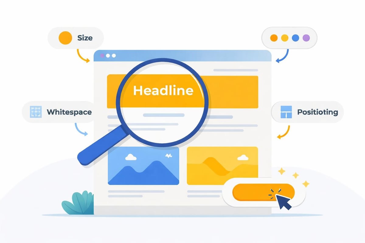
Essential Visual Hierarchy
Visual hierarchy organizes content in order of importance, directing user attention to the most critical elements first. This principle applies to everything from homepage layouts to individual page sections.
- Size and scale: Larger elements naturally draw more attention than smaller ones
- Color and contrast: Strategic use of color highlights important calls-to-action
- Whitespace: Adequate spacing between elements prevents visual clutter
- Typography hierarchy: Heading levels (H2, H3) create clear content structure
- Positioning: Elements placed in the upper-left or center receive priority viewing
Implementing proper visual hierarchy means users immediately understand what matters most on each page. Your primary call-to-action should stand out clearly, while secondary information supports but doesn't compete with main content. This organizational approach significantly impacts how quickly visitors can accomplish their goals on your site.
Core Design Elements That Drive Success
Several specific elements work together to create effective basic website design. Understanding how these components interact helps you build sites that perform well across multiple metrics.
Navigation Architecture
Navigation serves as your website's roadmap, enabling visitors to explore your content efficiently. Poor navigation ranks among the top reasons users abandon websites, making this element critical to basic website design success.
Your main navigation should include 5-7 primary categories maximum. Too many options create decision paralysis, while too few force users into unnecessary clicking. Consider implementing:
| Navigation Type | Best Use Case | User Benefit |
|---|---|---|
| Top horizontal menu | Main site sections | Quick access to primary pages |
| Hamburger menu (mobile) | Space-constrained displays | Clean mobile interface |
| Footer navigation | Secondary pages, legal | Complete site map access |
| Breadcrumb trails | Multi-level sites | Location awareness, easy backtracking |
Clear, descriptive labels eliminate guesswork. Avoid clever terminology that confuses visitors. "Services" communicates more effectively than "What We Do," while "Contact" beats "Let's Chat." Direct language respects user time and improves usability.
Typography and Readability
Text forms the foundation of most website content, making typography choices crucial to basic website design. Your typeface selections impact both aesthetic appeal and functional readability.
Font pairing guidelines recommend using no more than two or three typefaces across your entire site. Typically, this includes one font for headings and another for body text. This consistency strengthens brand recognition while maintaining visual harmony.
Readability depends on several technical factors:
- Font size: Body text should be at least 16px for comfortable reading
- Line height: 1.5 to 1.75 spacing prevents cramped, difficult-to-read paragraphs
- Line length: 50-75 characters per line optimizes reading speed
- Contrast: Sufficient color contrast between text and background ensures accessibility
The best practices for high-converting websites emphasize that readable content keeps visitors engaged longer, increasing the likelihood they'll take desired actions.
Color Theory Application
Color psychology influences user perception and emotional response to your website. Basic website design leverages color strategically to reinforce brand identity and guide user behavior.
Start with a primary brand color that represents your business identity. Add 2-3 complementary colors for accents, calls-to-action, and visual variety. Maintain consistency across all pages to strengthen brand recognition and create a cohesive user experience.
Consider color meanings in your industry context:
- Blue: Trust, professionalism, security (popular for finance, healthcare, technology)
- Green: Growth, health, sustainability (common for environmental, wellness brands)
- Red: Urgency, excitement, passion (effective for sales, entertainment)
- Orange: Friendliness, creativity, enthusiasm (suitable for creative industries)
Your call-to-action buttons should use a contrasting color that stands out from your overall palette. This visual distinction naturally draws attention and encourages clicks without requiring extra text or design elements.
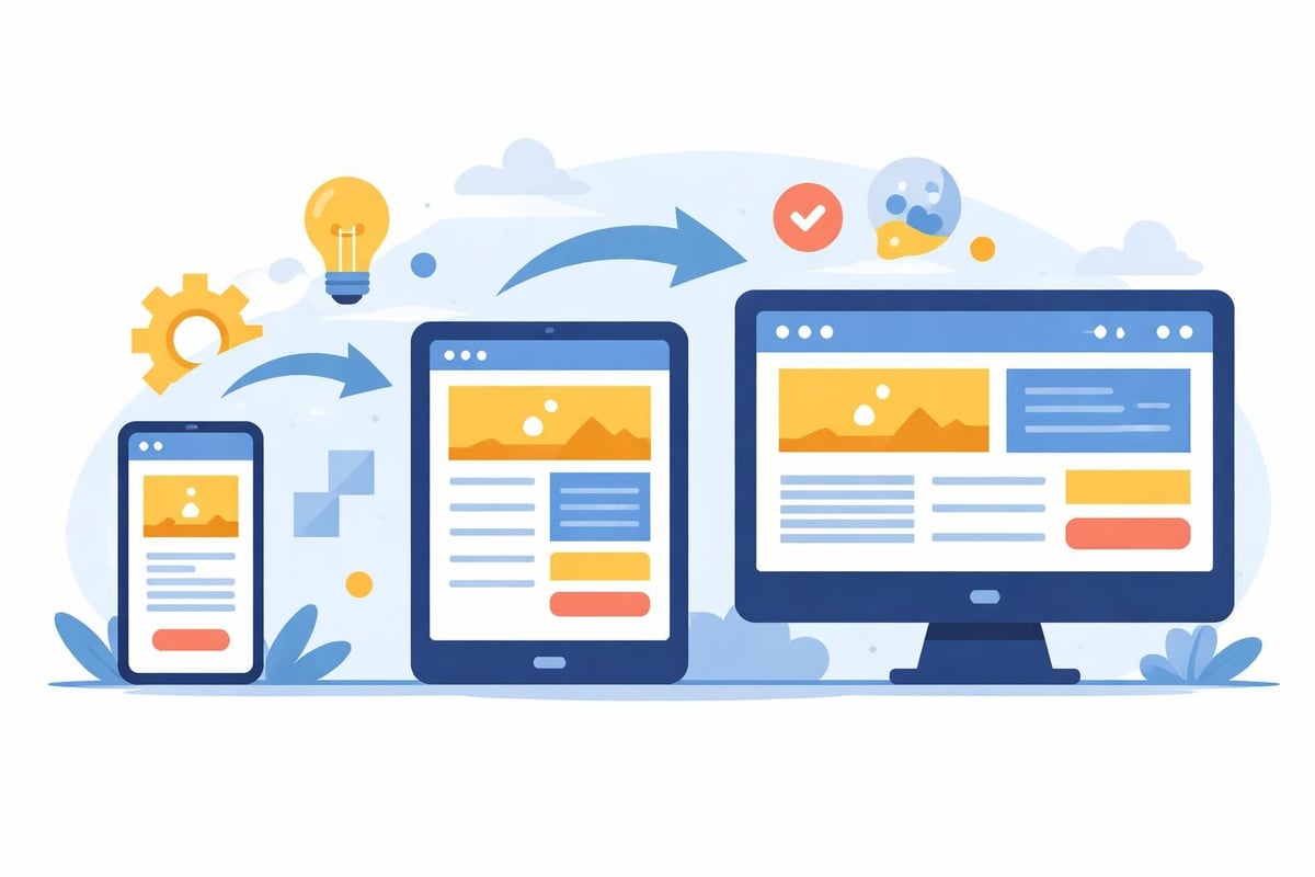
Responsive and Mobile-First Design Principles
Mobile devices generate over 60% of web traffic in 2026, making responsive design non-negotiable for basic website design. A mobile-first approach prioritizes smaller screens during the design process, then scales up for tablets and desktops.
Responsive frameworks automatically adjust layouts based on screen size. This adaptability ensures your content remains accessible and visually appealing regardless of how users access your site. Key responsive elements include fluid grids, flexible images, and media queries that trigger layout changes at specific breakpoints.
Optimization for Touch Interfaces
Mobile users interact through touch rather than mouse clicks, requiring different design considerations. Buttons and links need adequate size and spacing to prevent accidental taps.
- Minimum touch target size: 44x44 pixels ensures easy tapping
- Spacing between elements: At least 8 pixels prevents mis-taps
- Thumb-friendly zones: Place important actions within easy reach
- Horizontal scrolling: Avoid requiring side-to-side movement
Testing your responsive design website across actual devices reveals usability issues that desktop-only testing misses. Simulator tools help, but nothing replaces real-world testing on phones and tablets.
Performance Optimization Fundamentals
Site speed directly impacts user experience, search rankings, and conversion rates. Basic website design must incorporate performance optimization from the beginning, not as an afterthought.
Image Optimization Strategies
Images typically account for the largest portion of page weight, making them the primary target for optimization efforts. Modern formats and compression techniques dramatically reduce file sizes without visible quality loss.
| Format | Best For | Key Advantage |
|---|---|---|
| WebP | Photos, graphics | 25-35% smaller than JPEG |
| AVIF | High-quality images | Superior compression |
| SVG | Logos, icons | Infinitely scalable |
| JPEG | Photographs | Wide compatibility |
Implement lazy loading to defer offscreen images until users scroll near them. This technique significantly improves initial page load time, especially on content-heavy pages. The basic principles of good website design stress that performance optimization contributes directly to user satisfaction and engagement metrics.
Code Efficiency
Clean, efficient code loads faster and performs better across all devices. Minifying CSS, JavaScript, and HTML removes unnecessary characters and whitespace, reducing file sizes by 20-40%.
Consolidate multiple style sheets and scripts into single files when possible. Each separate file requires an additional server request, slowing page rendering. Modern build tools automate this process, combining files during deployment while keeping development code organized.
Browser caching stores static resources locally, eliminating the need to download them on repeat visits. Properly configured caching headers can reduce server load by 60% or more for returning visitors.
Content Structure and Information Architecture
How you organize information determines whether visitors find what they need or leave in frustration. Effective basic website design creates logical content hierarchies that mirror user mental models and search patterns.
Homepage Priorities
Your homepage serves multiple audiences simultaneously, from first-time visitors to returning customers. Balance these needs by establishing clear priority zones that address different user intents.
The hero section (top of page) should immediately communicate what you offer and who you serve. A compelling headline paired with a supporting subheadline and primary call-to-action captures attention and sets expectations. This critical space determines whether visitors continue exploring or bounce immediately.
Below the fold, organize content into digestible sections that progressively provide more detail. Common homepage sections include:
- Value proposition: Core benefits and differentiators
- Services or products: Brief overview with links to detail pages
- Social proof: Testimonials, case studies, client logos
- About snippet: Company story or team introduction
- Secondary calls-to-action: Newsletter signup, contact forms
Internal Linking Strategy
Strategic internal links help users discover related content while distributing authority across your site. Every page should include 3-5 contextual links to relevant internal pages, creating a web of connections that encourages deeper exploration.
Link placement matters significantly. Links embedded naturally within body content receive more clicks than sidebar or footer links. Descriptive anchor text that previews destination content performs better than generic "click here" phrases.
Consider how your web design strategy connects pages logically. Product pages should link to related items, blog posts should reference relevant services, and service pages should connect to case studies demonstrating results.
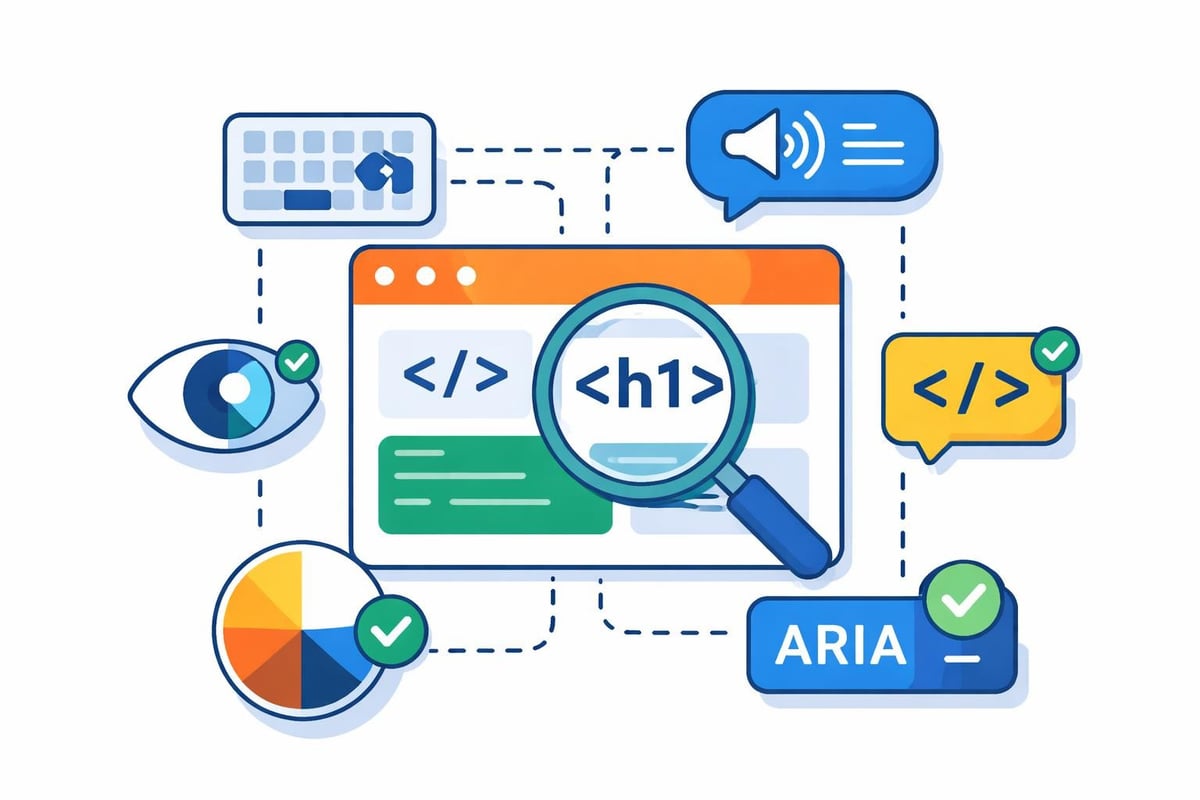
Accessibility and Inclusive Design
Accessible design ensures everyone can use your website effectively, regardless of physical abilities or assistive technologies. Basic website design incorporates accessibility from the start rather than retrofitting compliance later.
The nine principles of good web design from the Digital Skills and Jobs Platform highlight accessibility as fundamental to website functionality. These standards benefit all users while specifically enabling those with disabilities.
Key Accessibility Requirements
Implementing accessibility involves both technical and design considerations. Start with these essential practices:
- Alternative text: Descriptive alt attributes for all images enable screen readers to convey visual information
- Keyboard navigation: All interactive elements must be accessible without a mouse
- Color contrast: WCAG AA standard requires 4.5:1 ratio for normal text
- Form labels: Clear, programmatically associated labels for all input fields
- Heading structure: Logical heading hierarchy (no skipped levels) aids navigation
Semantic HTML tags (header, nav, main, article, footer) provide structure that assistive technologies can interpret correctly. These tags replace generic div containers, adding meaning that benefits both users and search engines.
Conversion-Focused Design Elements
Every website exists to achieve specific business goals, whether generating leads, selling products, or building awareness. Basic website design incorporates conversion optimization throughout the user experience.
Call-to-Action Optimization
Effective calls-to-action (CTAs) combine compelling copy with strategic placement and visual prominence. Your primary CTA should appear multiple times throughout longer pages, capturing users at different engagement levels.
Button copy should emphasize value or outcome rather than mechanics. "Get Your Free Audit" outperforms "Submit Form," while "Start Saving Today" beats "Sign Up Now." Action-oriented language that specifies benefits increases click-through rates significantly.
Placement testing reveals optimal CTA positions for your specific audience. While hero sections generate strong initial conversions, mid-page CTAs often capture users after they've consumed supporting information. Exit-intent popups can recover abandoning visitors with targeted offers.
Trust Signals and Social Proof
Visitors need reassurance before taking action, especially for unfamiliar brands. Trust signals reduce perceived risk and validate your credibility through third-party endorsement.
Display these elements prominently:
| Trust Element | Impact | Placement Recommendation |
|---|---|---|
| Client testimonials | High | Homepage, service pages |
| Case studies | High | Dedicated section, relevant service pages |
| Security badges | Medium | Checkout, contact forms |
| Professional certifications | Medium | Footer, about page |
| Media mentions | Medium | Homepage, press section |
Modern web design leverages technology to enhance capabilities without requiring extensive manual coding. For businesses seeking to launch quickly without sacrificing quality, agencies now use AI to drastically accelerate the coding and structural setup of custom websites, delivering professional results in weeks rather than months while maintaining the high-performance standards essential for ranking well across search platforms.
Forms and User Input Design
Forms represent critical conversion points where design quality directly impacts completion rates. Basic website design treats forms as user-centered experiences rather than data collection tools.
Field reduction improves completion rates dramatically. Request only essential information during initial contact. Each additional field decreases submission likelihood by approximately 5-10%. Save detailed questions for later stages after establishing relationship trust.
Clear error messaging helps users correct mistakes quickly. Inline validation provides immediate feedback rather than waiting for submission. Specific error descriptions ("Email address must include @") guide users toward solutions better than generic "Invalid input" messages.
Progress indicators for multi-step forms set expectations and reduce abandonment. Users complete longer processes when they understand how many steps remain and can track advancement toward completion.
Search Engine Optimization Integration
Basic website design and SEO work synergistically when implemented together from the beginning. Technical SEO elements should integrate seamlessly into your design framework rather than being added later.
On-Page SEO Fundamentals
Each page requires optimization for specific topics and keywords. Title tags, meta descriptions, and heading structures communicate content themes to search engines while organizing information for users.
URL structure should reflect site hierarchy using descriptive, keyword-rich paths. "/services/web-design" communicates more than "/page-47" to both search engines and users. Clean, logical URLs improve click-through rates from search results and aid navigation.
Internal linking distributes authority across your site while helping search engines understand content relationships. Strategic links to your homepage design website guidance and other relevant resources create topical clusters that strengthen overall domain authority.
Technical SEO Considerations
Site architecture impacts crawlability and indexing efficiency. XML sitemaps guide search engines to all important pages, while robots.txt files prevent crawling of administrative or duplicate content areas.
Structured data markup helps search engines understand content context, enabling rich search results that improve click-through rates. Schema.org vocabulary provides standardized formats for marking up products, services, articles, reviews, and dozens of other content types.
The web design best practices for 2026 emphasize that modern basic website design must account for both traditional search engines and emerging AI-powered search platforms that interpret content differently.
Content Management and Scalability
Basic website design should accommodate growth without requiring complete redesigns. Planning for scalability ensures your site structure supports future content expansion and feature additions.
Modular Design Systems
Component-based design creates reusable elements that maintain consistency across pages while enabling flexibility. Design systems document these components (buttons, cards, forms, headers) with usage guidelines that ensure coherent implementation.
Template variations handle different content types while preserving overall site cohesion. Blog posts, service pages, and portfolio items each require specific layouts, but all should share common design patterns and navigation elements.
This modular approach simplifies updates and additions. New pages draw from existing components rather than requiring custom design work, dramatically reducing development time and maintaining visual consistency.
Analytics and Continuous Improvement
Launching your website marks the beginning of an optimization journey rather than the end of a project. Basic website design incorporates analytics tracking that reveals how users interact with your site.
Key Metrics to Monitor
Different metrics reveal different aspects of website performance. Track these core indicators to understand user behavior and identify improvement opportunities:
- Bounce rate: Percentage of single-page sessions indicates content relevance and engagement
- Average session duration: Time spent reveals content value and user interest
- Pages per session: Multiple page views suggest effective internal linking and engagement
- Conversion rate: Goal completions measure business objective achievement
- Exit pages: Where users leave identifies friction points or content gaps
Heat mapping tools visualize where users click, scroll, and spend time on pages. This data reveals whether your design hierarchy successfully guides attention toward important elements or whether users miss critical calls-to-action.
A/B testing different design variations provides empirical evidence about what works for your specific audience. Test headlines, button colors, form lengths, and layout arrangements systematically to optimize conversion rates based on actual user behavior rather than assumptions.
Mastering basic website design principles creates digital experiences that attract visitors, build trust, and convert browsers into customers. These fundamentals remain relevant regardless of technology changes because they address core human needs for clarity, efficiency, and accessibility. When you're ready to build a website that excels across traditional search engines and emerging AI platforms, Creotivity combines proven design principles with cutting-edge optimization techniques to deliver sites that rank highly and convert effectively. Our team transforms basic website design concepts into custom solutions tailored to your business goals and target audience.